The annual Yale University Art Gallery’s Board of Trustees dinner honored Robert & Anna Shapiro, collectors and donors of modern and contemporary art, for their significant gifts to the Gallery. I was shown this photograph by Tim Davis to draw inspiration for the table centerpieces for the dinner tables.
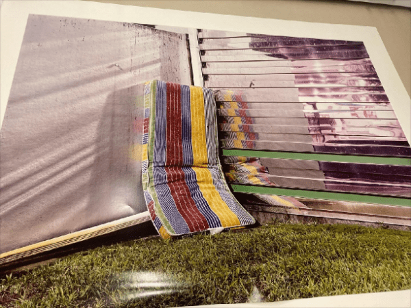
Initially I had a hard time wrapping my head around this image. The event planner assignment: “I am looking for centerpieces that are minimal in design. Would like the floral colors to replicate the colors of the striped chaise. And, the container to reflect the metal backdrop. So I want a very standard style composed centerpiece (nothing wild in design). The nod to the artwork would be in the colors of the flowers and the contemporary metal container. Does that make sense to you?”
Honestly, I was baffled. So I focused on the reflective metal surfaces and thought of the holographic materials I had recently worked with on my 50th high school reunion wondering if I could source material that I could laminate onto a glass cube container:
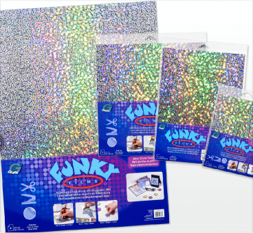
The reflective, fractile colors intrigued me . The planner sent me the best result of her search with the disclaimer: “I found something cool, but it is only a bud vase which wouldn’t be able to hold many stems. But maybe we could do something at the base?”
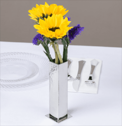
This suggestion intrigued me as it resonated with the metal slats in the photo but a further search yielded nothing large enough for a centerpiece and clustering 5+, enough to make a statement, broke her budget before I even considered what flowers to use.
In speaking to a colleague, I mentioned this challenge and her response was “ You just sent me a photo of containers to consider for our collaboration that seem to me are perfect for this job!”
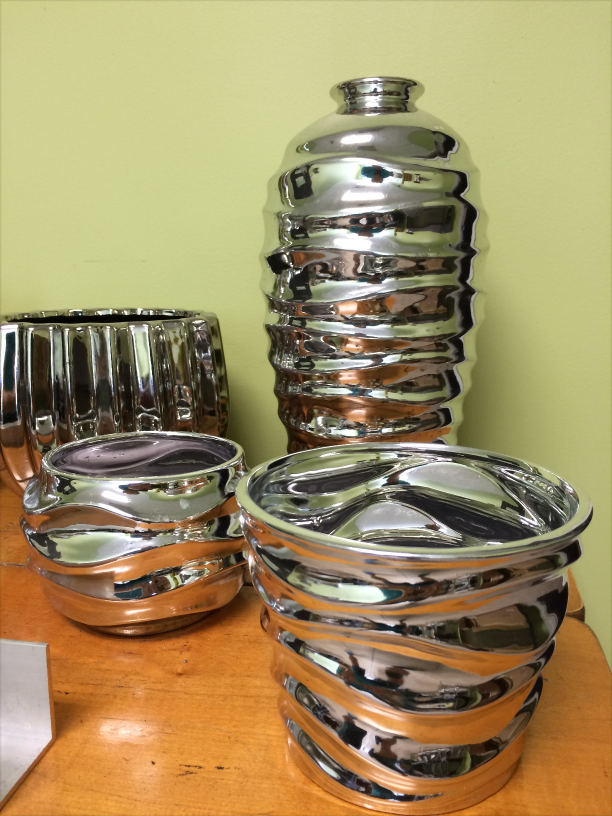
She was right! I was chagrined! The wavy bands were just what I was looking for! The undulating reflections were exactly what makes this photo ART! Finally, I “got it” on all levels!
So now back to the image. The palette was set by the 1990s chaise mattress, primary colors plus white. The linear textile design suggested organizing the floral materials in stripes. The flower varieties should at once be pedestrian; Mums, but should also suggest movement, distortion and something unique/intriguing. Plus, I sensed that something playful/fun was called for too.
I settled on blue Veronica tipped in green, Craspedia , balls on sticks; coxcomb, brains, for their wavy appearance and interesting velvety, absorbing texture and Kangaroo paws, also velvety, wild and animated form.
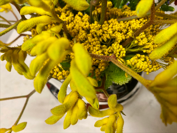
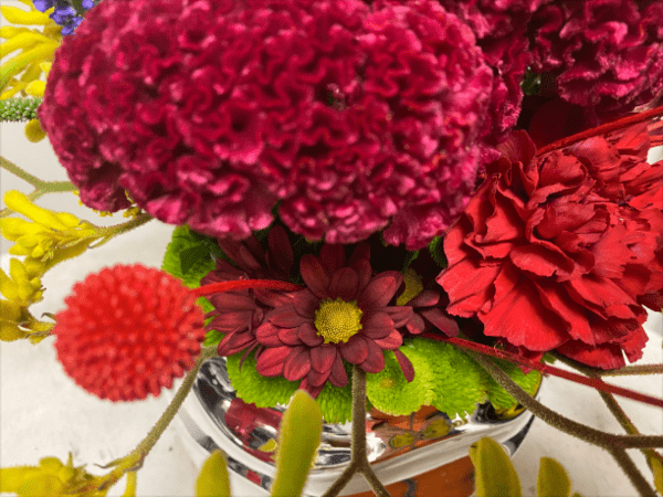
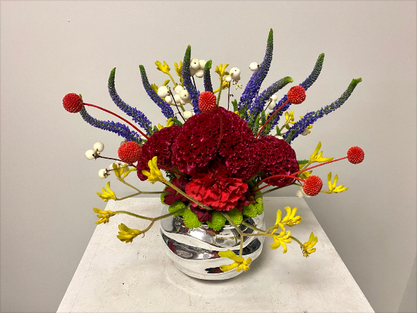
My first pass organized these flowers in the mattress rows:
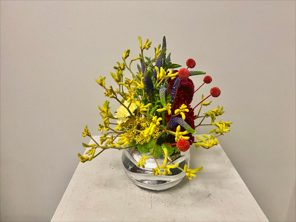
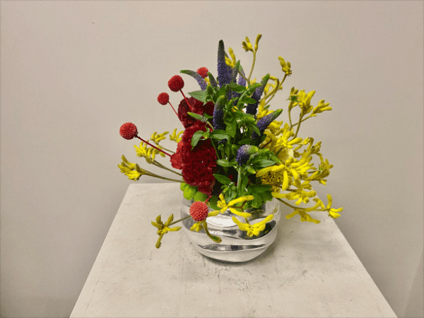
The playfulness was there and pleased me but, overall, it seemed too exotic given the planner’s request : “So I want a very standard style composed centerpiece (nothing wild in design).”
I was loving the direction I was headed and felt confident that she would let go of her “standard style” if I could increase the scale and proportion of pedestrian flowers in the design. The yellow side also seemed “flat” to me. The textures of the yellow flowers absorbed light and their impact was too dispersed. Where was the color/energy emanating from? The dark shadow of the burgundy coxcomb was energetically dead.
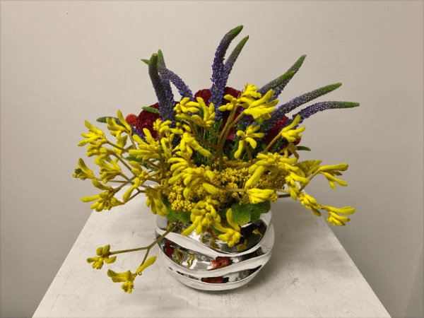
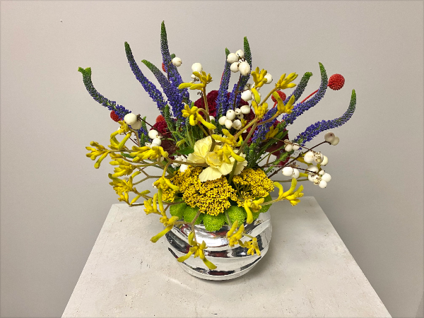
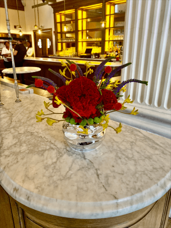
I looked around the studio and saw leftover carnations in yellow and several shades of red. Including these large blooms anchored the red and yellow bands of color and gave the hovering elements, (the Craspedia and k paws) a bright light to dance in front of!
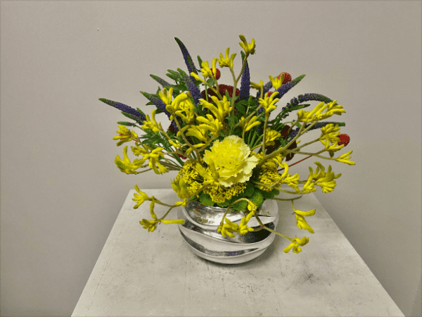
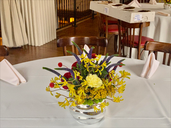
While the carnations did the trick energetically and bolstered the common button and Daisy pompom mums, I still had not managed to incorporate a discreet, read minor, nod to the white striping of the textile. I was so close, but time had run out and my client was thrilled with my efforts: “Thank you, my friend. You definitely deliver the WOW factor!” So off they went to the party!
The next day at my studio I was purging the walk-in of flowers when I spotted a bucket of white snowberry and suddenly it clicked! This was the missing piece!
